Aresta
Free material. Precise mark.
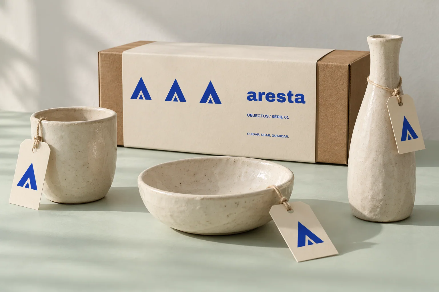
The starting point
Independent ceramics
A ceramics brand needed to connect differently proportioned objects without hiding the texture and irregularity of the material. The system had to work on small labels and packaging paper.
The idea
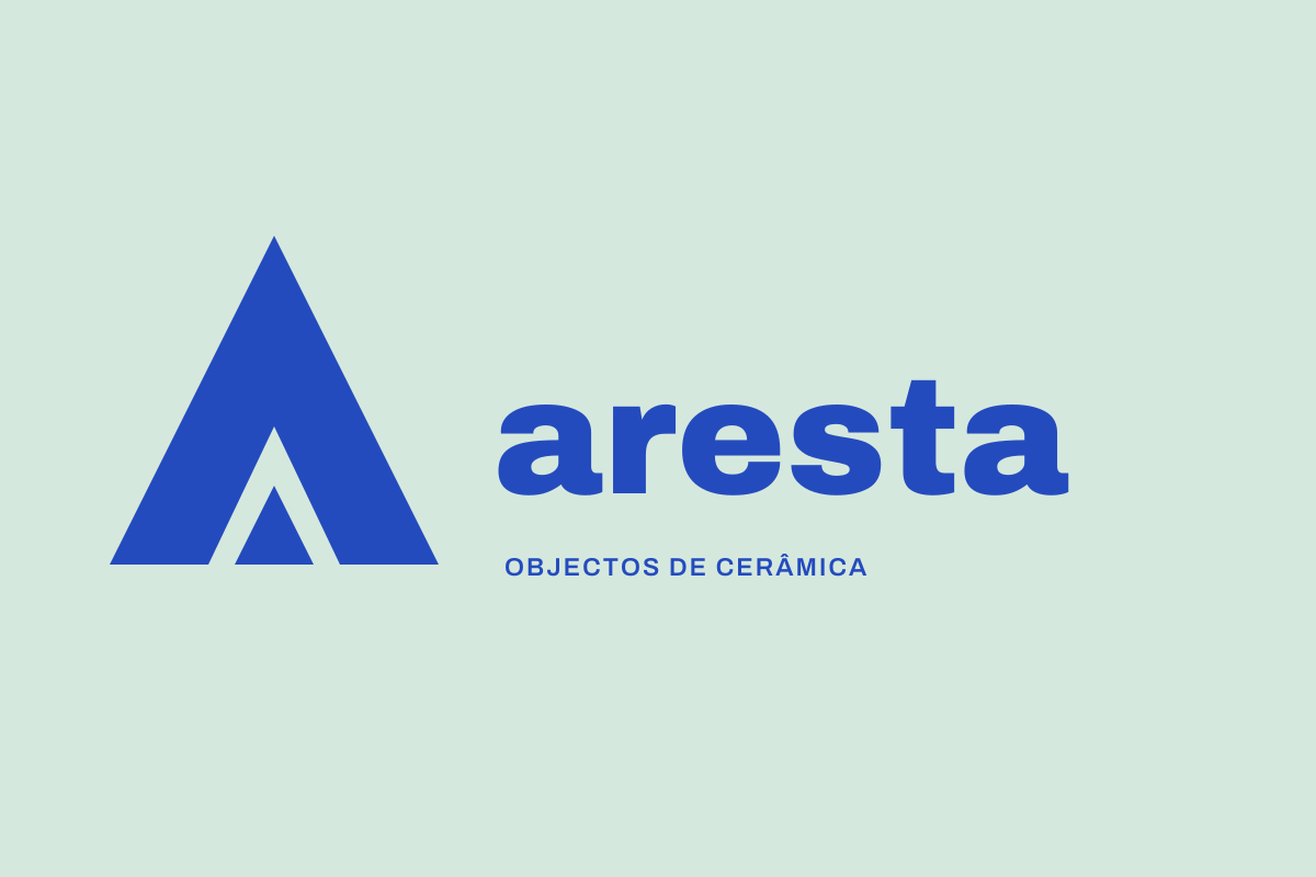
An A built from three planes introduces firm geometry beside organic surfaces. Cobalt blue makes the family recognisable; uncoated paper and soft green leave room for the material.
What we designed
- Maker’s mark & wordmark
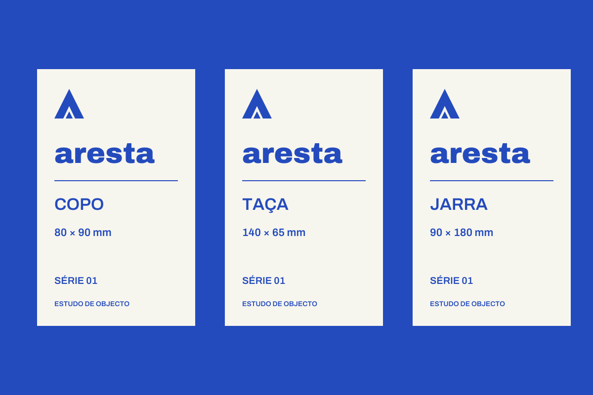
- Labels for three objects
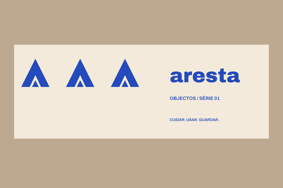
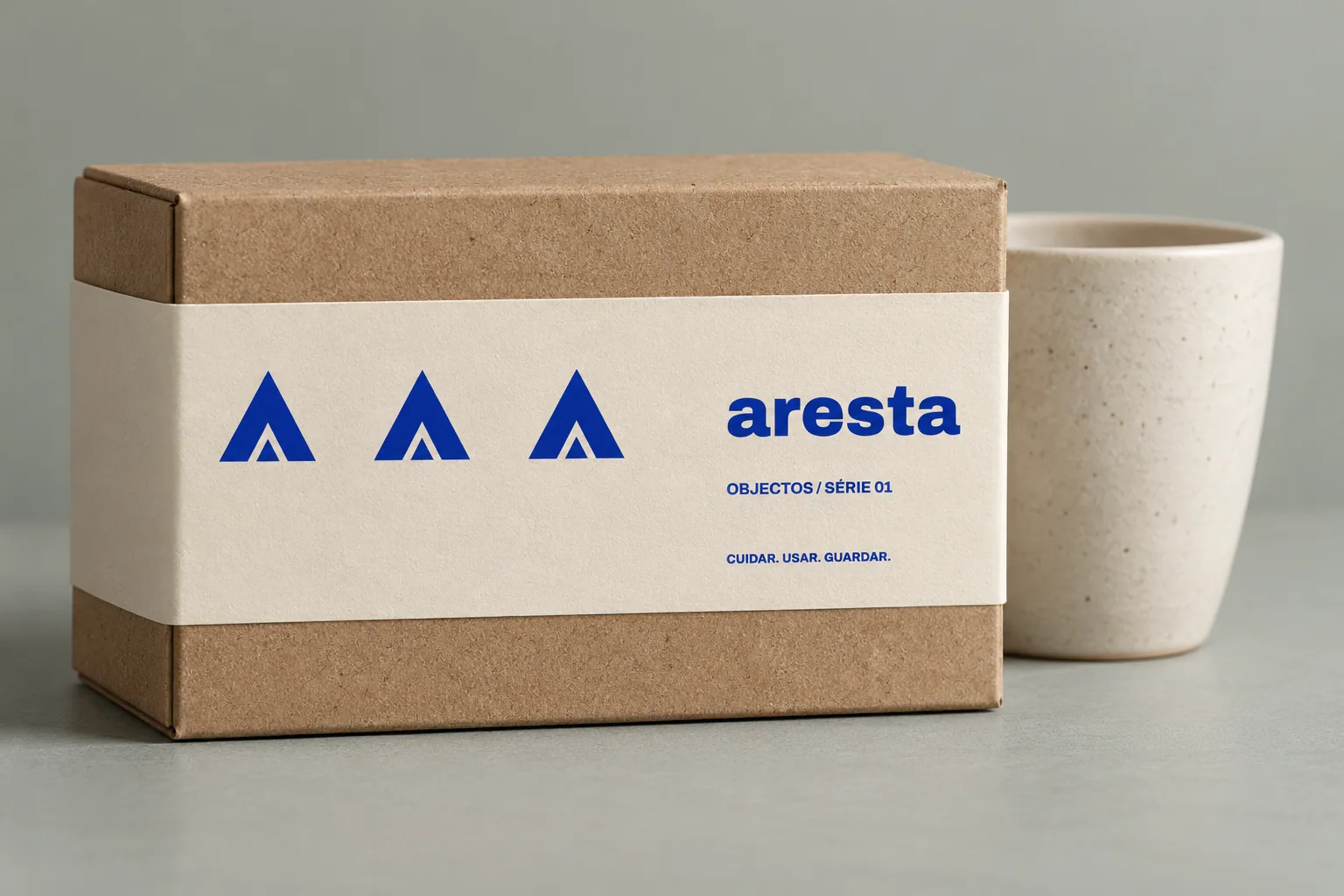
- Packaging sleeve
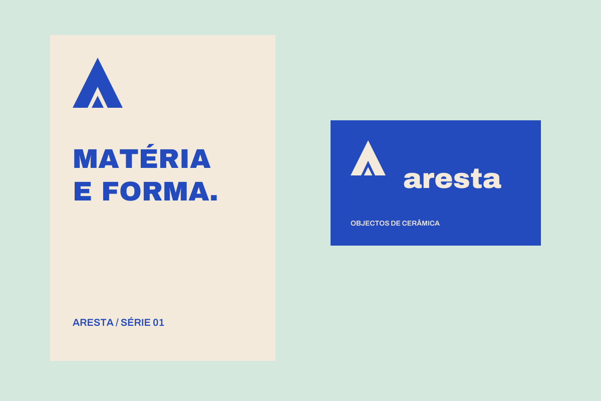
- Card & presentation sheet
VISUAL LOGIC
A system, not a single piece.
#244BBD
#D5E8DE
#F3EADB
#BCA98F
- The mark retains three planes and a central opening; it does not imitate an origin seal.
- Labels always order object name, dimensions and series consistently.
- The sleeve repeats the mark and uses one print colour.
Planning a project with this scope?
Start a project ↗