Caju
A family in the pantry.
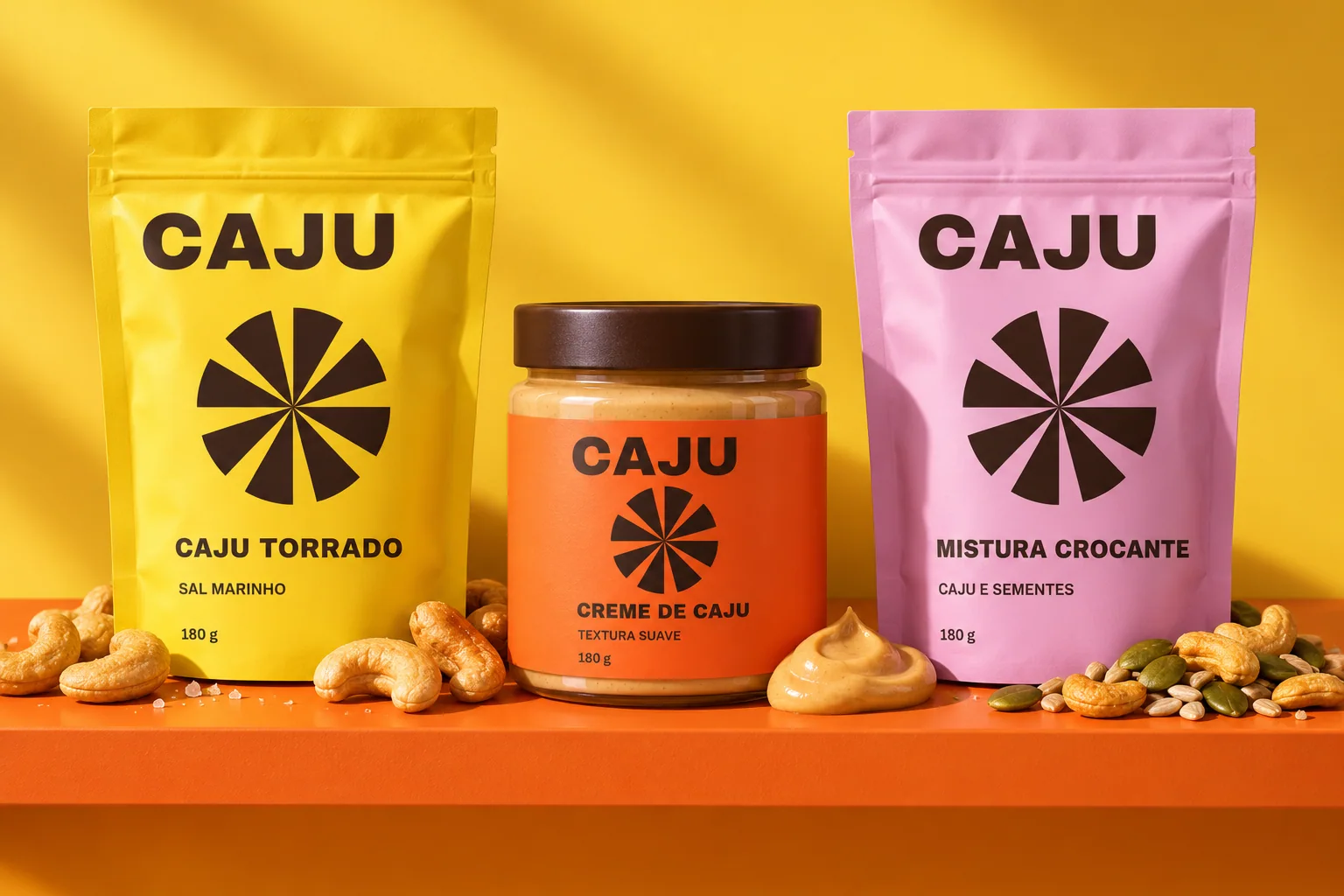
The starting point
Pantry food
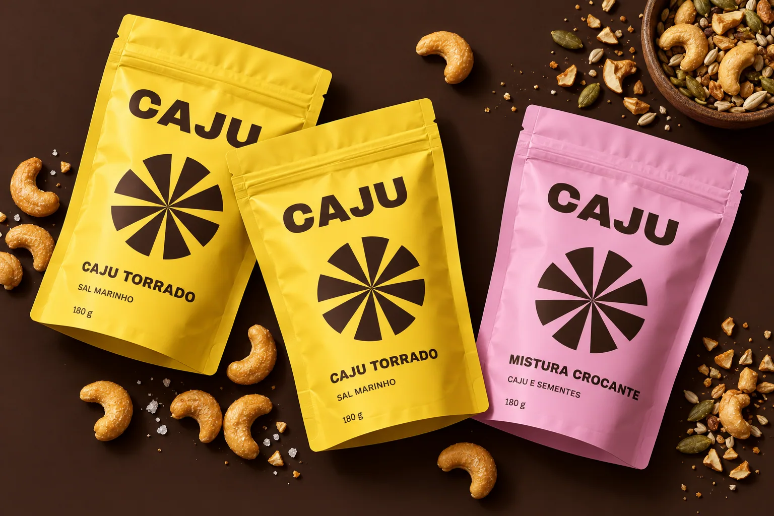
Three products in a concept pantry — roasted cashews, cashew spread and a crunchy mix — needed a common reading, even in different packaging formats.
The idea
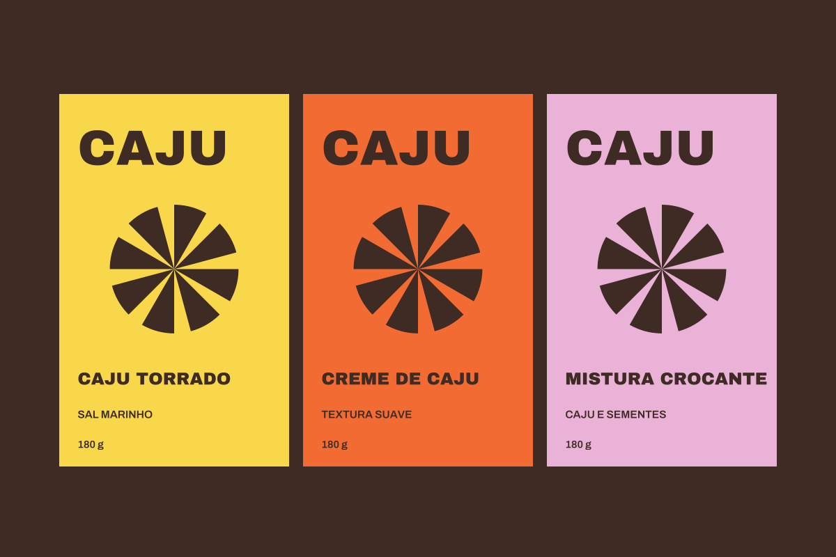
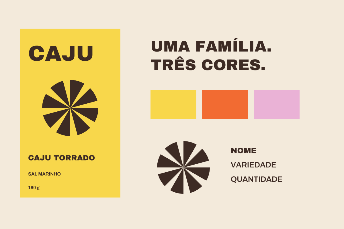
A sturdy wordmark, a radial shape and three colours build a recognisable family. The shape occupies the centre; name, variety and quantity stay in predictable positions. Differentiation does not depend on colour alone.
What we designed
- Wordmark & radial motif
- Three 180 g pack fronts
- Shelf family relationship
- Communication graphics

VISUAL LOGIC
A system, not a single piece.
#F8D74B
#F26B32
#EAB2D6
#3D2B24
- Eight separated sectors form the radial motif; proportions stay constant across products.
- Yellow, orange and pink distinguish variants with names written in full.
- The labels shown are front-of-pack studies, not regulatory production artwork.

Planning a project with this scope?
Start a project ↗